Main Color Gradient
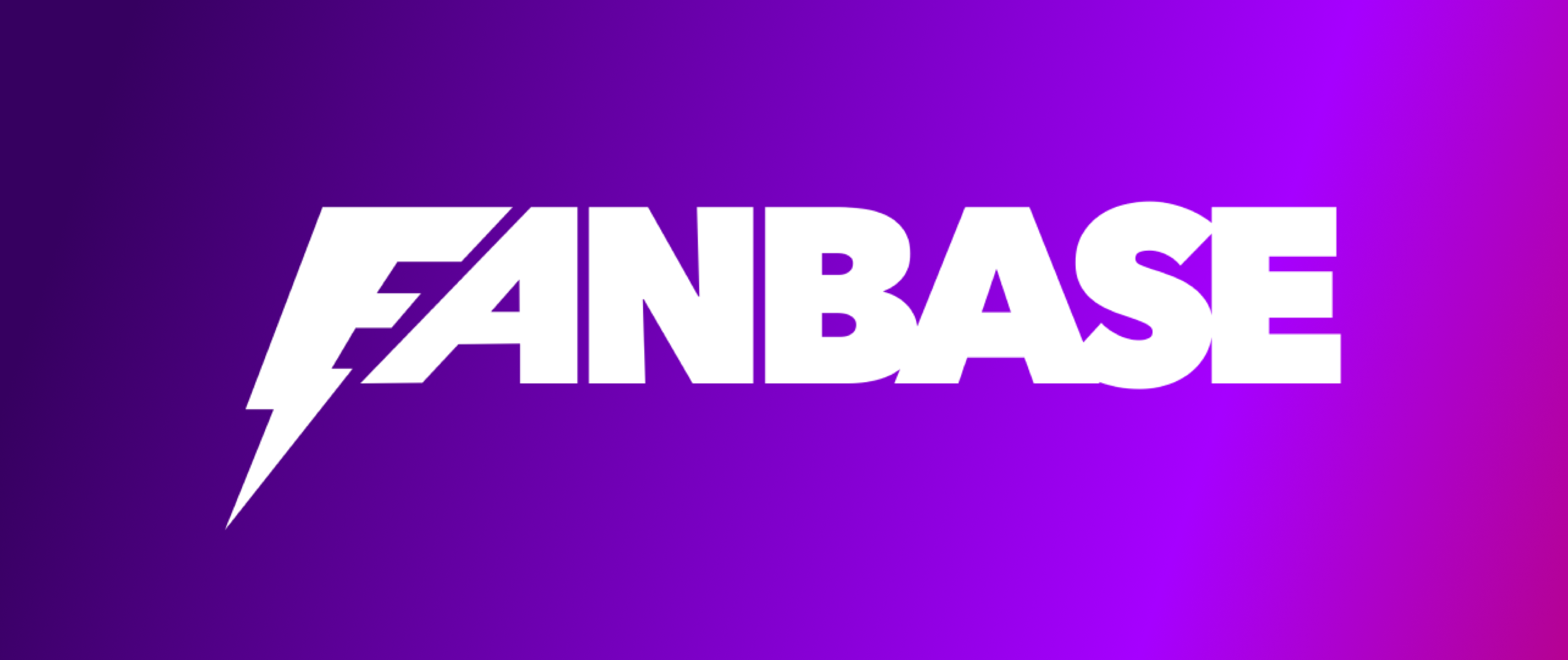
Like a free spirit, the Fanbase logo is meant to go solo. Thus, it shouldn’t be paired with any other brand element nor should it be modified or distorted.
Moreover, all colors and visual elements must be respected to maintain visual consistency.
When using the icon alone, the following criteria should be taken into account:

Always write Fanbase altogether, F being the only uppercase letter.
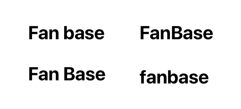
Do not split the brand or add uppercase letters.
When using the icon alone, the following criteria should be taken into account:
This is the official black version
to be used in white and light contexts.
This is the official white version
to be used in black and dark contexts.
As we've previously stated, colors play a big role in brand identity and should always be respected.
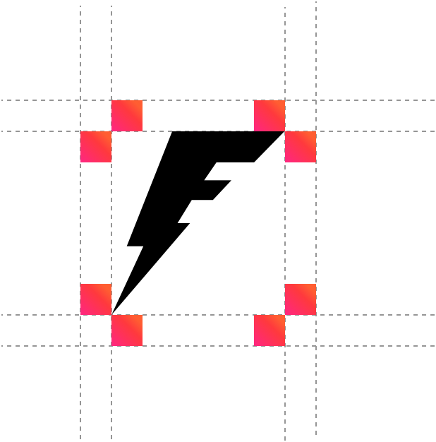
To guarantee the logo is always clear and legible when applied elsewhere, we have established a minimum size.
The Fanbase logo should therefore remain within the specified measurements.

To ensure the Fanbase logo doesn't overlap with other elements when placed next to each other, the safe
zone should always be the height of the “F” top terminal applied on all sides.
Visual consistency is key, especially when it comes to logo usage. To prevent any misinterpretation,
the Fanbase logo should never be modified or added to.
Always respect the safe zone.
Do not place the Fanbase logo next to or above other copy elements.
Do not distort the Fanbase logo.
Do not rotate or flip the Fanbase logo.